Trimming diff output in the web gui?
(1) By Alfred M. Szmidt (ams) on 2021-03-01 07:10:32 [source]
When viewing a check-in, it would really nice if one could not show the changes for added / removed files. Sometimes they can be large, and slightly annoying to scroll through.
Or maybe clicking on a file change which collapses it (or expands it).
(2) By Stephan Beal (stephan) on 2021-03-01 07:23:10 in reply to 1 [link] [source]
Or maybe clicking on a file change which collapses it (or expands it).
A cursory glance at the HTML structure suggests that that wouldn't be difficult to do. i'll add that to my TODO list to try out (while admittedly hoping that someone else will beat me to it).
Patches happily considered!
(3) By Stephan Beal (stephan) on 2021-03-01 17:20:00 in reply to 2 [link] [source]
A cursory glance at the HTML structure suggests that that wouldn't be difficult to do.
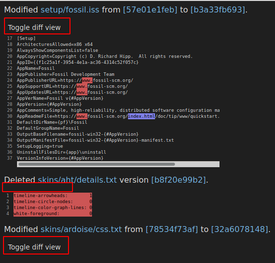
Here's a proof of concept which injects toggle buttons to the diff views when the page loads:
https://fossil.wanderinghorse.net/screenshots/fossil-diff-view-toggle.png
This screenshot shows 3 properties of the concept code, from top to bottom:
"Mid-sized" diffs (based solely on their pixel height within the DOM) are shown by default but have a toggle button. (The styling in that skin makes them look like non-buttons, but they're really buttons.)
"Tiny" diffs don't get a toggle button at all.
"Large" diffs are hidden by default but have a toggle button.
Again, that's just proof of concept, not set in stone.
This applies to both unified and sbs diffs.
Does this approximate what you're looking for?
(4) By Stephan Beal (stephan) on 2021-03-01 17:37:34 in reply to 3 [link] [source]
Here's a proof of concept which injects toggle buttons to the diff views when the page loads:
And here's a copy you can try out if you like:
fossil:/timeline?r=diff-view-toggle-poc
(Again - this is just proof of concept, not a final/best effort.)
(5) By Alfred M. Szmidt (ams) on 2021-03-01 19:25:05 in reply to 3 [link] [source]
That is more or less exactly what I was thinking! Maybe the "Toggle diff view" line could be on the same line as the rest of the file information?
Added foo/bar.c version [zorkbork] <show diff>
?
Very cool!
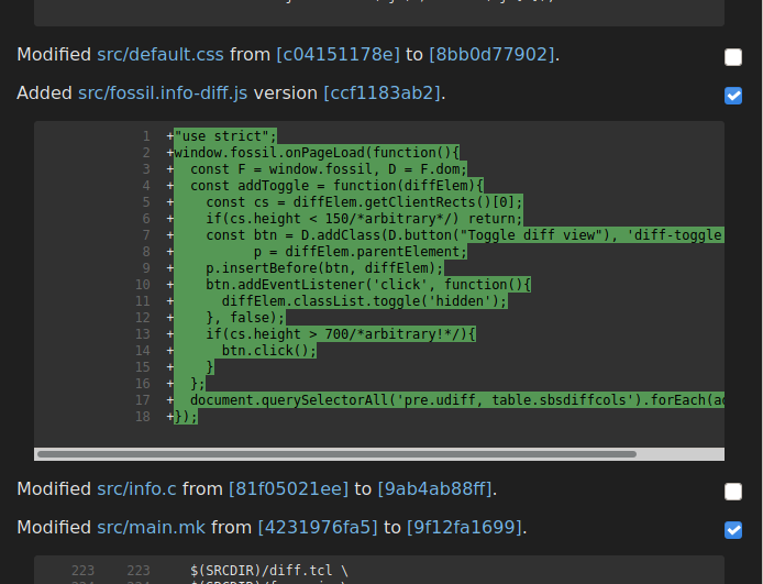
(6.1) By Stephan Beal (stephan) on 2021-03-02 04:30:37 edited from 6.0 in reply to 5 [link] [source]
Very cool!
You will probably like this 2nd attempt better:
https://fossil.wanderinghorse.net/screenshots/fossil-diff-view-toggle2.png
It's checked in to the above-linked branch if you'd like to try it out. If there are no objections in the next day or so i'll go ahead and merge this, as it's a tiny change, degrades fine when JS is disabled (works just like before), and is a genuine usability bonus.
The automatic determination of which diffs to show/hide by default was removed, as it was painfully arbitrary. They're all shown by default, but they're now trivial to toggle with a right-hand thumb on a phone. Lefties may move the checkbox to the left by adding this to the site's skin:
input[type="checkbox"].diff-toggle {
    float: left;
    margin-right: 0.5em; /* optional */
}
Sidebar: this adds approx. 5.5kb of JS to the page (edit: compressed), but it's aggressively cached. If fossil is configured to serve JS in "bundled" mode (which it should be except during development of JS code), that's only a single HTTP request and the response's cache lifetime is approx. 1 year. That 5.5kb could be reduced to maybe 1-1.2kb, but it would mean reimplementing it without the benefit of the handy-dandy fossil JS framework-level code. That would not be difficult but is beyond my current aspirations. Anyone wanting to patch it to do so is welcomed to (there will be no objections from me).
(7) By MG (mgr) on 2021-03-02 17:42:59 in reply to 6.1 [link] [source]
Very nice!
(8) By Alfred M. Szmidt (ams) on 2021-03-02 21:50:49 in reply to 6.1 [link] [source]
As someone else said, very nice! That is exactly what I was after! Thank you!
(9) By Stephan Beal (stephan) on 2021-03-03 01:41:26 in reply to 8 [link] [source]
That is exactly what I was after!
i'll get it merged in later today or tomorrow, so keep an eye on the trunk.
(10) By sean (jungleboogie) on 2021-03-03 19:41:38 in reply to 1 [link] [source]
I know I'm late to the party and so my voice here is understandably muted; however, I'm curious why we like the checkboxes right of the files.
My preference would be to have it left of "Modified". If I'm browsing with all files displayed, I'll likely want to know the file name and uncheck/check a file while looking at the file name, not travel across the page to do so.
Yes, a first world problem and I'll happily live with someone else's logic why they're on the far right.
I noticed when comparing/diffing changes between multiple check-ins, the checkboxes are not present. Is that deliberate, since you probably want to view all changes anyway?
example: https://fossil-scm.org/home/vdiff?from=025a007249d38962&to=d21e3c5a3ad30525
Thank you Stephan for implementing this idea so quickly. It's definitely a great enhancement.
(11) By Stephan Beal (stephan) on 2021-03-04 01:35:19 in reply to 10 [link] [source]
My preference would be to have it left of "Modified".
i'm guessing you're left-handed? Having to move the right hand (for right-handed folks) across the field of view for the toggle is a no-no. My preference would have been to have the toggles all directly at the end of the file info, but that would put each checkbox in a different vertical position, requiring much more searching for the checkbox and would eliminate the possibility of developing muscle memory regarding their positions. Far right on a wide screen is admittedly annoying, but it's less annoying than the alternatives. My suspicion is that the toggles will be most welcomed on mobile device, and they're in a "natural" position for such use.
One option would be to make that whole line clickable but my initial experiment with that led me to accidentally toggling several times while trying to scroll on a touchscreen.
I noticed when comparing/diffing changes between multiple check-ins, the checkboxes are not present. Is that deliberate, since you probably want to view all changes anyway?
An oversight. i'll patch that after work.
(12) By sean (jungleboogie) on 2021-03-04 02:10:23 in reply to 11 [link] [source]
i'm guessing you're left-handed?
I can see how you made that guess, but I'm actually right-handed, like you. :) To me the checkbox is across my field of view, since I'm looking at the text info: "Modified www/gsoc-ideas.md from [b5a2d53c] to [35f97098]." when scrolling down, for example.
My preference would have been to have the toggles all directly at the end of the file info, but that would put each checkbox in a different vertical position, requiring much more searching for the checkbox and would eliminate the possibility of developing muscle memory regarding their positions.
Right, I can definitely see how that would interrupt the flow of someone looking for a checkbox.
This is clearly something pedantic on my part. Thanks a million for putting this in!
An oversight. i'll patch that after work.
Awesome. Enjoy your morning at work.